The basics still matter. We just made them visible.
Every few months a new acronym arrives. GEO. AEO. LLMO. Each one is presented as the thing that changes everything. Each one is mostly a repackaging of things that already mattered. This is not one of those posts.
The problem with chasing the new thing
The SEO industry has spent twenty-five years in a state of managed panic. Every algorithm update, every new platform, every shift in how people search arrives with the same energy: everything you knew is wrong, here's the new playbook, move fast or be left behind.
Some of that urgency is legitimate. The search landscape is changing in ways that matter — the rise of AI assistants as answer engines, the fragmentation of search across platforms, the shift from "give me a list of links" to "give me an answer." These are real changes with real implications.
But the response to them — chase the new acronym, bolt on the new tool, optimise for the new surface — misses something. Some people, and I include agencies and companies here, have decided that AI search means the old rules don't apply. That the techniques that got penalised out of existence a decade ago might work again on a new platform that hasn't caught up yet. Spam, essentially, with a different coat on. I have clothes older than some of the practices being repackaged as AI strategy right now. "I've written this script that produces a full list of semantically relevant websites in the right target audience for your demographic. Totally disrupts the whole market, which is what I do. Is it a guest post on Money Saving Expert? Yes." It isn't. It's a list. And the answer was always no.
The things that make a site perform well for AI agents are the same things that have always made a site perform well. Structure. Clarity. Semantic coherence. Content that actually answers the question being asked: what are you about, why do I need you, how do you answer the question I haven't even thought of yet.
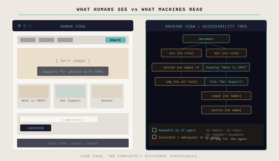
The new thing isn't a new set of rules. It's a new audience reading the same page. And that audience is less forgiving of the corners we've been cutting for years. Equally grateful, it turns out, are the people who struggle to navigate the web — the users who rely on screen readers, keyboard navigation, and properly labelled interfaces to access content the rest of us take for granted. The structural work that makes a page readable to an AI agent is the same work that makes it accessible to a human who needs it to be. That's not a coincidence. It's the point.
Why this exists — what converged
Three things arrived in roughly the same window. Lighthouse — Google's own performance auditing tool — quietly updated to check AI-specific signals: whether a site has an llms.txt file, whether its structured data is readable by agents, whether its content is organised in ways machines can parse. Dixon Jones published work on entity mapping — visualising what a site actually talks about as a connected graph of topics rather than a flat list of keywords (read it here). And a post on LinkedIn about how AI agents read websites via the accessibility tree rather than the visual layout made it clear that the structural and semantic layers were converging in ways nobody had joined up yet.
None of those things alone was the insight. The insight was that they were all pointing at the same problem from different directions — and that the tools available to most website owners and clients to understand that problem were either too technical, too fragmented, or too focused on a single layer to show the full picture.
That's the actual reason this exists. Not to chase a new acronym. To make it clearer — genuinely clearer, in plain language with illustrations that don't require a technical background to read — what is going on with a site, where the gaps are, and what to do about them. Most tools produce data. This produces a diagnosis.
For a while these threads existed separately. Accessibility auditing tools checked WCAG compliance — semantic landmarks, labelled elements, alt text — things that matter for screen readers and, it turns out, matter for AI agents in almost identical ways. Crawlers checked response codes, redirect chains, page speed, canonical tags. Entity and semantic analysis sat in specialist tools that most clients never saw.
None of these talked to each other. None of them produced a single picture of whether a site was actually performing in the environment it now operates in.
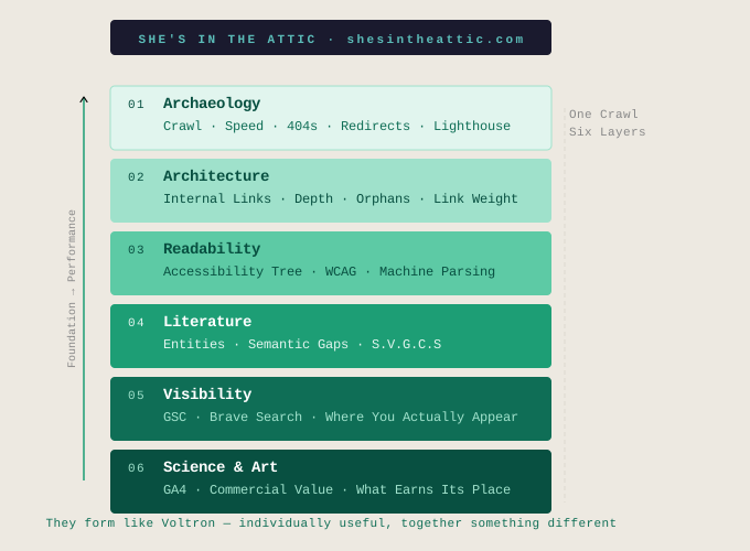
So we connected them. One crawl. Six layers. Each one informing the next.
The six layers — what we built
Archaeology — the technical foundation. We built our own crawler so we could plug in site speed data, Lighthouse AI signals, Google Search Console, and GA4 alongside the basics — 404s, redirect chains, canonical tags, crawlability, response times. Off-the-shelf crawlers give you a spreadsheet. This gives you a connected picture of what's broken, what's slow, and what impact those things are having on performance and revenue. A site that can't be crawled can't be indexed. A site that can't be indexed can't be found. This hasn't changed.
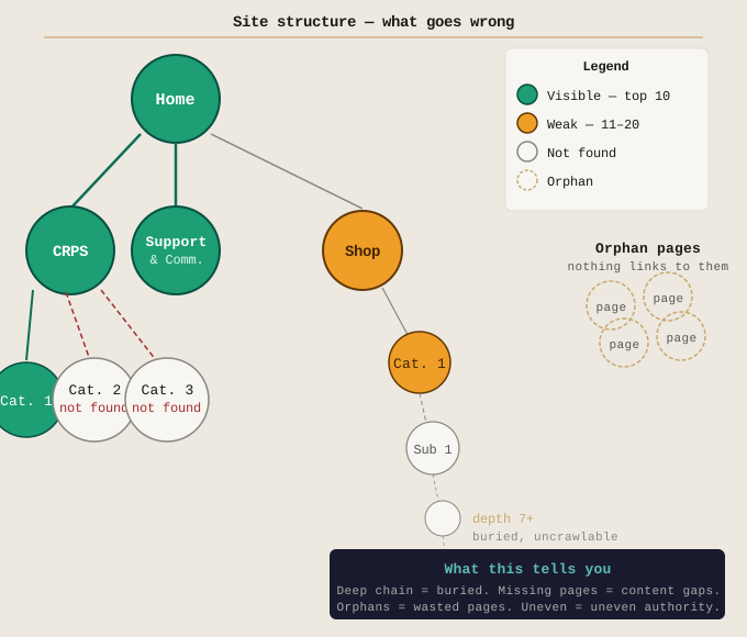
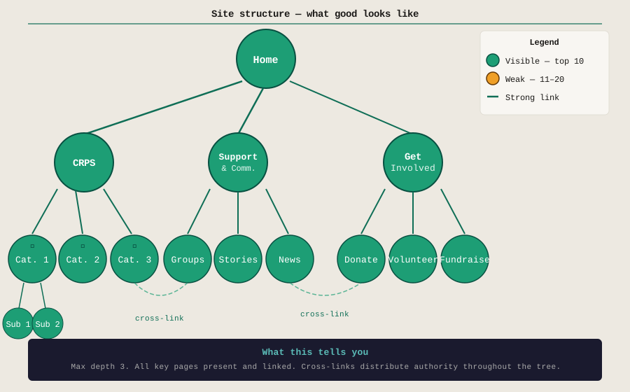
Architecture — how the site is connected to itself. Internal link structure, page depth, orphan pages, the weight of links flowing between sections. The lines between nodes aren't decoration. A thick line means many internal links pointing at a page — the site is actively declaring that page important. A thin line means one or two. A dashed line means the page exists but nothing points to it. Internal links are how a site declares its own priorities to a machine. Most sites declare very different priorities to what their owners intend — because nobody designed the internal link structure deliberately. It accumulated.
The strength of the relationship between pages matters as much as the relationship itself. A site that talks about one topic on one page and a closely related topic on another, but never links between them, is telling machines those topics are unrelated. The link is the signal. We visualise this — internal links as weighted connections, external links layered on top — so the architecture of a site becomes readable to anyone, not just developers.
One important caveat: a lopsided or uneven site structure doesn't necessarily mean a site is performing poorly. Plenty of sites with unconventional architectures rank well and convert. What the architecture layer is looking for isn't conformity to a template — it's gaps and opportunities. Where is authority not flowing to pages that deserve it? Where are orphaned pages sitting unused? Where could a few internal links unlock visibility that's currently buried? The structure tells you where to look, not necessarily what's broken.
Readability — how machines read the page. This is where the accessibility audit sits, and where the overlap with WCAG 2.0 becomes meaningful. Semantic landmarks — <main>, <nav>, <header> — tell an AI agent where the content is. Labelled buttons and form fields tell it what the interactions do. Alt text on images tells it what the images contain. A page without these things is readable by humans and largely opaque to machines. This is where most sites are quietly failing.
Literature — what the site actually talks about, how it describes itself from within, and how that maps back to the structural layer. This is the entity and semantic layer — the one most people haven't seen yet. We map the topics a site covers, the relationships between them, the synonyms and related concepts that establish genuine authority in a subject area. The gaps in that map show you exactly what content is missing and where the internal linking should be strengthened to signal those connections. Then we map the same thing for a competitor. The gaps become immediately visible.
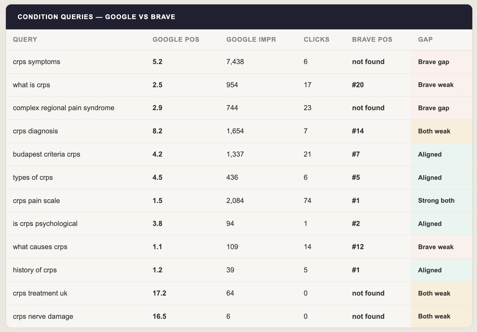
Visibility — where the site actually appears when people search. This is where Google Search Console and the Brave Search API come in. We run the same set of target queries through both and compare the results. The divergence between what Google sees and what Brave sees is the diagnostic. Brave Search powers Claude's web results. If a site appears in Google but not in Brave, it's invisible to Claude's answers regardless of how well it ranks on the SERP.
Why Brave specifically? Most privacy-focused search engines — DuckDuckGo, Ecosia — are skins on top of Bing's index. Brave built their own independent index from scratch. That matters because it means Brave's rankings aren't identical to Google's or Bing's. Studies confirm that 86.7% of the results Claude pulls when answering web-based queries overlap with Brave Search, with limited re-ranking — Brave's order largely holds. If you want to know whether a site appears in Claude's answers, Brave Search position is the closest measurable proxy available. It's not a perfect signal. It's the best one we have.
Science & Art — the commercial layer. GA4 data mapped against the structural and visibility findings. Which pages are visible and valuable. Which are visible but not converting. Which are invisible despite being the most commercially important. The layer that turns the audit into a business case rather than a technical report.
Each layer informs the next. The technical foundation enables the architecture. The architecture shapes the readability. The readability affects the Literature. The Literature determines the Visibility. The Visibility connects to the value. They form like Voltron — individually useful, together something different.
Rankings are a symptom
A note on how to read the visibility layer — because it's easy to reach for it as the headline metric and miss the point.
Rankings are the heron. You don't study the heron to understand the ecosystem. You study the river — the water quality, the fish population, the conditions that determine whether the heron eats. Rankings tell you whether the system is working. They don't tell you why it isn't, or what to fix.
The Brave vs Google comparison is useful precisely because the divergence it reveals points back at the structural and semantic layers. A page that ranks on Google but not in Brave has enough content for Google's tolerant, authority-weighted algorithm but lacks the structural clarity that Brave's more literal reading rewards. That tells you to fix the structure, not to write more content. A page that ranks on neither tells you the content doesn't exist or doesn't answer the question being asked. That tells you to fix the Literature layer.
The rankings follow the work. They're not the work.
What this looked like in practice
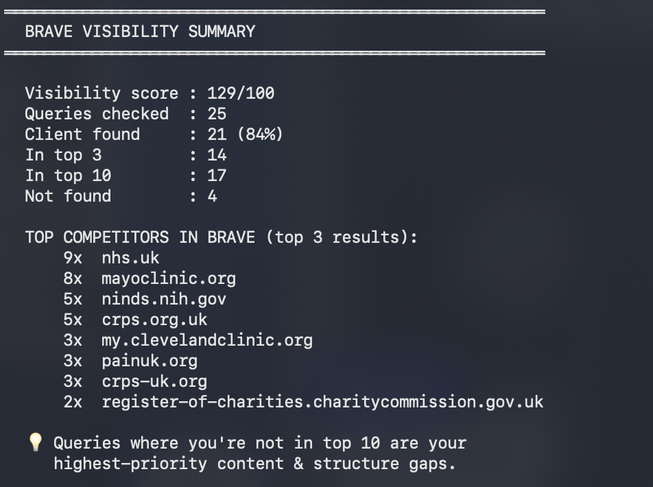
We ran the full audit on a UK charity providing information and support for people living with a rare and complex chronic pain condition. 988 pages. 25 tracked queries across four groups.
The brand and support queries were strong. The charity ranks #1 in Brave for its core support and awareness queries. Claude knows who they are and what they do.
The condition information queries told a different story. "CRPS symptoms" — 7,438 impressions in Google Search Console over 90 days, position 5.2. Not found in Brave's top 20. "Complex regional pain syndrome" — position 2.9 on Google, 744 impressions. Not found in Brave. Two of the most fundamental queries for this charity's core mission, invisible to the AI assistant most likely to be consulted by someone newly diagnosed with a chronic pain condition.
The readability audit explained why. Every page on the site is missing <main> and <nav> landmarks — 1,976 instances of the same template-level omission across all 988 pages. 7,786 unlabelled interactive elements. 1,765 images without alt text. Overall accessibility grade: D.
The fix for the structural issues is a single template change by the development agency. It resolves across all 988 pages simultaneously. The content fixes are four pages that don't exist yet.
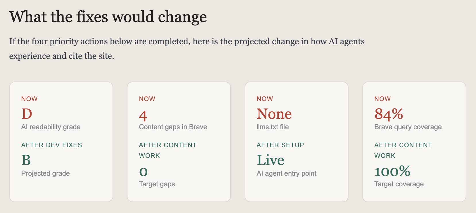
Fix the template. Write the four pages. The Brave visibility follows. The Google rankings improve. The AI citations happen. In that order.
The competitor currently beating them
One of the sites appearing in Brave's results for these queries that our client is missing from was built on Wix. It uses stock photography of people at whiteboards. Its connection to the condition is the name.
It is outranking a specialist charity with years of credible, medically informed content because of structure — not substance. That is the clearest possible illustration of why the structural layer comes first.
What's coming next
The Literature layer — S.V.G.C.S — or Semantic Vector Generation and Compliance System — because every love story might still be a love story but it's not written the same way. This is the part of the audit that has no real equivalent in standard SEO tooling. Entity extraction, semantic coverage mapping, competitor comparison, gap identification. Not keyword research. Semantic architecture. The way a site describes itself from within, the synonyms it uses, the related concepts it connects — or fails to connect — all mapped and measured against what a competitor covers and what the search landscape expects.
We'll publish more on that in Part 2, along with the visualisation work — because one of the things we've learned building this is that the most technically accurate output is useless if the person reading it can't immediately understand what they're looking at. The tree diagram showing site structure, colour-coded by visibility. The bubble map showing topic coverage, sized by semantic depth. The competitor overlay showing where coverage diverges.
Separately — and connected — we're also writing about measurement. Specifically about how GA4 is being misread, misconfigured and misused across most of the accounts we see. The commercial layer of the audit is only as good as the data feeding it. That piece is available now.
We also ran the full six-layer audit on this site — shesintheattic.com itself. The findings, including the gaps, are published as a case study: We ran our own audit on ourselves. Here's what it found.
Illustrations that make the invisible visible. Which is, when you strip everything else away, what this has always been about.
If the gap matters to you
The audit is a service. It takes time, it uses real API data, and it produces a report designed for non-technical stakeholders as much as for developers and SEOs. The findings go to the people who can act on them, framed in language they can use.
If you want to understand where your site stands — not just on Google, but in the environment that's actually emerging — the contact form is on this site. It won't be free. But if the question matters, it's worth asking.